PermalinkWhat is CSS grid?
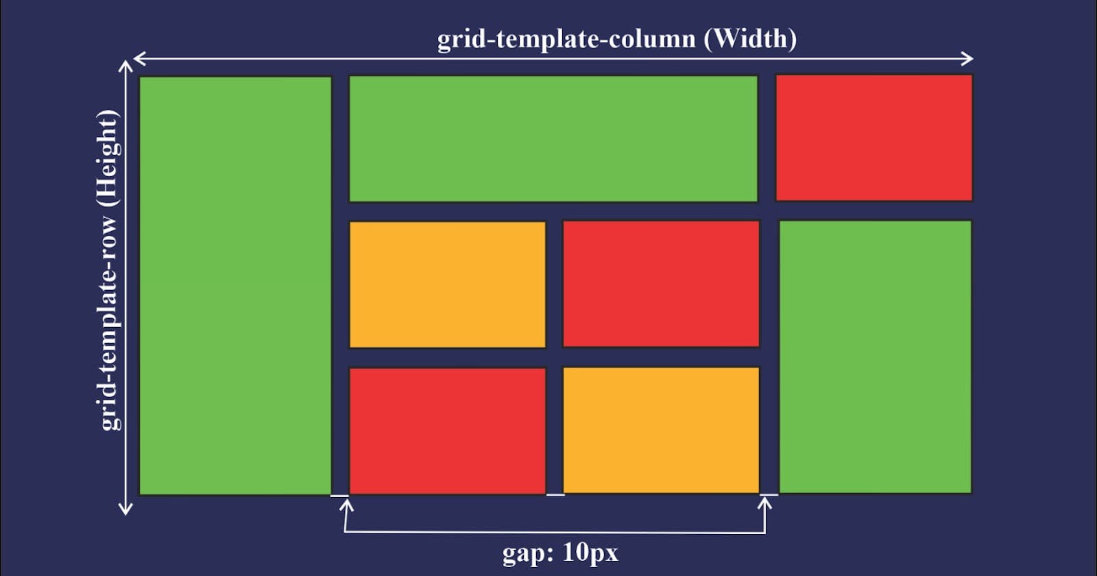
CSS grid is a two-dimensional layout model which is used for layout the items in rows and columns.
PermalinkWhat is CSS Grid use for?
CSS Grid Layout excels at dividing a page into major regions or defining the relationship in terms of size, position, and layer, between parts of a control built from HTML primitives. Like tables, grid layout enables an author to align elements into columns and rows
Display grid Syntax
#gridParent{

     display: grid;
}
by default, it seems normal its behave on its columns and rows properties.
Permalinkgrid-template-columns
#gridParent
#gridParent{

    display: grid;
  grid-template-columns: 100px 100px 100px;

}
Above example, we created 3 columns with 100px size. Defining how many columns you want and how big they are in size is easy with this method but we have the repeat property for defining this efficiently.
#gridParent{

    display: grid;
   grid-template-columns: repeat(3,100px);

}
PermalinkGrid-template-rows
It is used for how large and how many rows are in the layout.
Note: Instead of px we are now using Fr which fraction size of elements space.
PermalinkGrid-auto-rows
We define our content in rows but wait what if you have a large number of rows? Then using this property we can define our row content size. Still, you are flexible to define different row sizes according to user choice.
Permalinkminmax
If we added to content in our grid items in large quantity but also defined your grid sizes then it simply overflows outside of the items, but we dont want that we want our item to grow with the size of the content but min size or max size.
PermalinkSpace between rows and columns
PermalinkGrid row gap
#gridParent{

    display: grid;
   grid-template-columns: repeat(3,100px);
   row-gap:20px;

}
defines the gap between rows in the layout
PermalinkGrid column gap
#gridParent{

    display: grid;
   grid-template-columns: repeat(3,100px);
   column-gap:30px;

}
defines the gap between columns in the layout
PermalinkShorthand of Gap
#gridParent{

    display: grid;
   grid-template-columns: repeat(3,100px);
   gap:10px 20px;

/*Row gap and column gap*/

}
PermalinkGrid templet areas
This is the most important property of the display grid. using the property you can build an entire webpage like header, footer main content, aside. while defining this property you have to define the row as equal to the column.
#gridParent{

    display: grid;
 grid-template-areas:
    "navbar navbar navbar navbar"
    "main-section main-section main-section aside" "footer footer footer footer";

}
.navbar {
  grid-area: navbar;
  background-color: #1c8d73;
}

.main-section {
  grid-area: main-section;
  background-color: #790ac9;
}

.aside {
  grid-area: aside;
  background-color: #02283a;
}

.footer {
  grid-area: footer;
  background-color: #02283a;
}
You can define single-element growth. you can also define the height and width of individual elements.
All thanks to Hitesh Choudhary Hitesh Choudharysir
